UX/ UI Design
My first experience designing websites dates back to 2017. The website was created to support my personal project, polishshop.art, and to promote Polish artists and designers abroad. This was created using Wix but ignited curiosity about UX and UI.
Over the last 6 months, I worked on a couple more projects while studying UX and UI Design, but this time I’ve been using Figma and designing everything from scratch. I have been exploring different types of user research, diving into ideation and wire framing, applying best practice of user centric design, and developing my UI skills along the way.
While studying at Bath Spa University’s short courses, I have designed both a website and a mobile app. It has been a wonderful journey so far and I can’t wait to build my confidence and skillset further with each new project.
You can read about each of these assignments below.
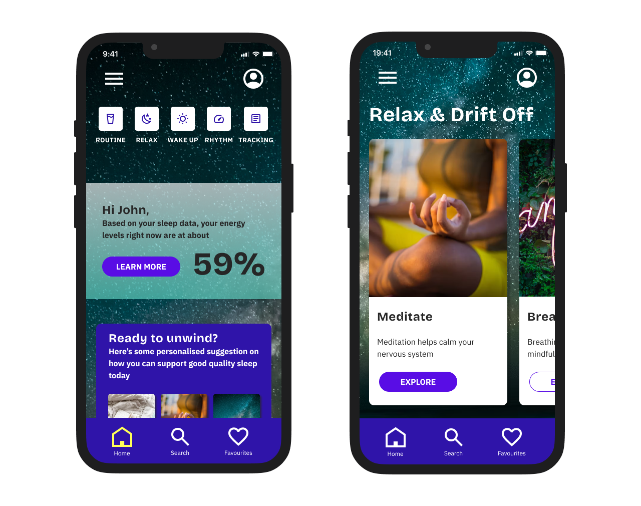
Arise mobile app -
case study

Type of project
Bootcamp assignment
Length
6 weeks
Role
UX and UI design
Tools
Figma
During UX/ UI Bootcamp with Bath Spa University, I’ve been working on a design for a mobile app.
While working on this project, I have been learning about the whole design process, from the initial research, through the define phase, then ideating and designing the final product, while seeking feedback and testing the product with users at various stages.
The bootcamp ended on the last week of March, which is when I presented one chosen user flow. Here’s the link to the interactive prototype for this flow: from the home screen all the way to the playlists and the player.
This is still work in progress, as I would like to develop more screens and build a working prototype for the whole app, however, your can read though all of my progress to date below.


Phoebe’s Cafe website -
case study
Type of project
UX/UI Course assignment
Length
4 weeks
Role
UX and UI design
Tools
Figma
During the Click Start Course with Bath Spa University, I had an opportunity to learn about the basics of UX and UI design, and apply this knowledge when working on my final project in Figma. This is the result of my very first attempt at designing a website from scratch.
Problem statement
Phoebe is an owner of a yet to open coffee store. Her new coffee store will be set in an urban creative area, popular with professionals, students and young families. She’s looking for opportunities to attract new customers before the store’s launch date. She’s struggling to know what to put on her website and whether she should consider other methods to help her create noise before the grand opening.
Teamwork
As a group, we were presented with the brief and encouraged to dive into crazy eights and a group discussion to explore different ideas and ways of approaching the assignment. I thoroughly enjoyed our group exercises and the whole ideation process.
I then intuitively started working on the information architecture and drafting some first low fidelity wireframes to summarise our team’s discussions.
Individual work
Later on, I carried on the work independently. I started with digitising my notes on IA and developing more mid-fidelity wireframes, while also completing some competitor analysis. As I was learning the basics of Figma, I produced all high-fidelity user interfaces and eventually a working prototype. During this process I would seek my tutors’, fellow students’ and friends’ feedback in order to test my designs and apply any feedback. It helped me improve the visual hierarchy, the contrast and the flow of my designs.
In the meantime, I expanded my knowledge of style guides and created one myself, specifically for this website.
Results and learnings
I was then proud to presented my work, the interactive Figma prototype, as my final project at the end of the course.
I have learned about different stages of the design process, got to experience the joy of team work during the ideation phase and how satisfying it is to then turn these ideas into design when developing them on my own.
While on this course, I also had an opportunity to learn the basics of HTML and CSS, which I know will be very useful when working and communicating with developers on any future projects.
At the end of the course, I was excited to sign up to the UX/UI Bootcamp, to be able to deepen my knowledge and develop further skills. I especially wanted to learn more about the UX research, testing and user centred design, as well as build my confidence in UI design. You can see how I progressed in this regard in my next case study.

polishshop.art website

Type of project
personal project
Length
3 weeks
Role
UX and UI design
Tools
Wix
polishshop.art was a Bristol based art gallery and concept store promoting young Polish artists, selling artworks and jewellery online, as well as organising pop up art exhibitions.
It was a personal project of mine, that I was working on in 2017 and 2018. Initially, I organised a photo shoot of paintings, set up a website and social media accounts, designed leaflets, organised international transport and an exhibition of paintings and collages for a Polish painter, Agata Szymanek in Bristol.
Later on, in collaboration with another Polish artist and maker, Barbara Adamiec, I co-designed a collection of jewellery, which then also featured on the polishshop.art website and social media.


